
How to Choose a Wedding Logo: Initials, Style and a Designer Brief
A wedding logo is a small design built around your names, initials or a shared motif. Before choosing one, decide where it will appear and what guests should be able to read. A logo that looks lovely on a large screen may need a simpler version for a small invitation corner.
Contents
Where to use it | Choose the initials | Pick a style | Real samples
Files and scope | Copy the designer brief | Approve the final logo
Sample jumps: Logo 02 | Logo 10 | Logo 16
Start with where you will use it
List the actual uses: a WhatsApp invitation, video opening, welcome board, envelope or favour tag. Give the designer the smallest placement and the largest printed size you expect to need. The logo can be prominent on an opening screen and smaller beside the event details.
Still choosing the invitation itself? See our video, PDF and image-card comparison before requesting the logo files.
Choose the letters and their order
Write both names exactly as they should appear, then confirm the initials and reading order together. If your family follows a particular convention, tell the designer. Do not rely on a template to decide whose initial comes first or whether a shared surname belongs in the design.
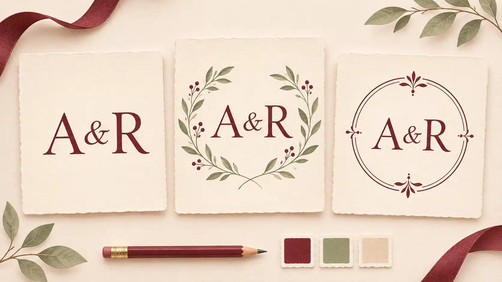
For Aanya and Rohan, compare A & R with R & A before choosing. An ampersand keeps two letters distinct. Interlocking letters can feel more decorative, but both should still be recognisable. If both initials are A, a separated A & A or the full first names may read more clearly than overlapping them.
Use a date only if you want it in the logo. Keep a version without the date in mind for other functions. If you need Hindi or another script, send the exact characters and ask someone who reads that language to check the proof.
Pick a style that suits the invitation
Choose one main direction rather than combining every motif you like. Simple lettering suits a quiet layout. A floral frame can echo flowers already used in the invitation. An ornamental emblem can suit a more detailed design, provided the lettering remains clear.
Give specific feedback: “We like the thin circular frame and open space around the letters” is more useful than “Make it royal.” Share two or three references and name what you like in each. Treat other couples’ designs as references, not artwork to copy exactly.
Compare three real 3VIDEO samples
These are existing gallery thumbnail stills, shown in the same order below. Open the linked videos to see the full samples. The thumbnail is a visual reference, not your final artwork or a file specification.

Logo 02 Illustrated floral frame. Decorated elephants and flowers surround the centre. Choose this direction when those motifs fit your celebration, and check that your initials have enough space.

Logo 10 Lighter floral circle. A fine gold circle and two flower clusters leave more open space. Check how clearly the pale lettering reads on a phone.

Logo 16 Dark decorative monogram. Gold M and K letters and fine flourishes sit on black. Ask how your initials will read at a smaller size and on a light background.
Confirm files and scope before ordering
Tell the designer what you need to do with the logo, then agree the deliverables. A finished invitation containing a logo is different from receiving a separate logo file.
For placing it over other artwork, ask whether a transparent PNG can be supplied at the required pixel size. Adobe explains PNG transparency. For larger print use, ask whether a vector version is available and suitable for the design. Adobe’s raster and vector guide explains why vector shapes scale without pixelation. A PDF filename alone does not guarantee vector artwork.
If the logo will appear on a welcome board, get the printer’s accepted format and size first. Our welcome-board printer checklist covers that handover.
Confirm the price, included changes, delivery time, separate-file availability and any extra charge for source files, new artwork or animation before paying. Do not assume an editable file, transparent background or animated version is included.
Copy this designer brief
Replace the brackets, delete anything you do not need, and send it with your references.
Names and spelling: [Name 1] and [Name 2].
Logo text: [Exact initials or names], in this order: [order]. Script: [language].
Date: [Exact date / no date].
Style: [Simple lettering / floral / ornamental / other].
Colours and backgrounds: [Colours]. It will sit on [light / dark / both].
References: [Links or sample numbers]. We like [specific details]. Please avoid [details].
Uses and sizes: [Invitation format, logo placement size, largest print size].
Versions requested: [With or without date, light or dark background, static or animated].
Files requested: [Formats and sizes needed by the printer or editor]. Please confirm availability.
Budget and timing: [Budget] and [date needed].
Please confirm: The total price, included revisions, delivery date and any extra cost before starting.
Example: “Aanya and Rohan, A & R in that order, no date. A thin floral circle in burgundy and sage on ivory. Use it in the opening of our invitation video and on a 40 mm favour tag. Please confirm the suitable files and quote for both uses.”
Check the final logo in its real setting
Review the actual version you will use, not only an enlarged preview. Ask the designer to place it on the invitation background and show the smallest planned size.
Letters and wording. Check the exact initials, order, names, script and date. Look for letters that merge or resemble a different character.
Small details. Read the design on a phone. If you are printing, check a proof at the intended physical size. Thin lines and tiny names may need simplifying.
Backgrounds. Check the light and dark versions you requested. A transparent background alone will not make pale letters readable everywhere.
Video use. Watch the complete preview. Check when the logo appears, whether it stays visible long enough to read, and whether it covers useful invitation details.
Delivered files. Open each agreed file. Check dimensions, background and spelling, and confirm that the printer or editor can use it.
Send one clear correction message, such as: “Please keep A first, separate the two letters slightly and remove the date. Show the revised logo on the ivory invitation background and at the favour-tag size.”
Once the logo is settled, use our wedding invitation proofreading checklist to review the rest of the invitation.
Choose a sample and send a clear brief
Browse the 3VIDEO wedding-logo collection, shortlist a sample and share the completed brief. Confirm what can be customised and which files are included before ordering.